Skip to content
x left X right

Develop your shop

Optimise your point of sale
How to arrange your delicatessen: our best advice for independent retailers

7 December 2023

Let’s take a closer look at the ideal layout for a delicatessen or fine food store. This type of shop is favoured by foodies on a quest to find the best quality products and seek expert advice from the retailers. In this article, we share our best advice on setting up a delicatessen efficiently and giving your customers a shopping experience to treasure. 

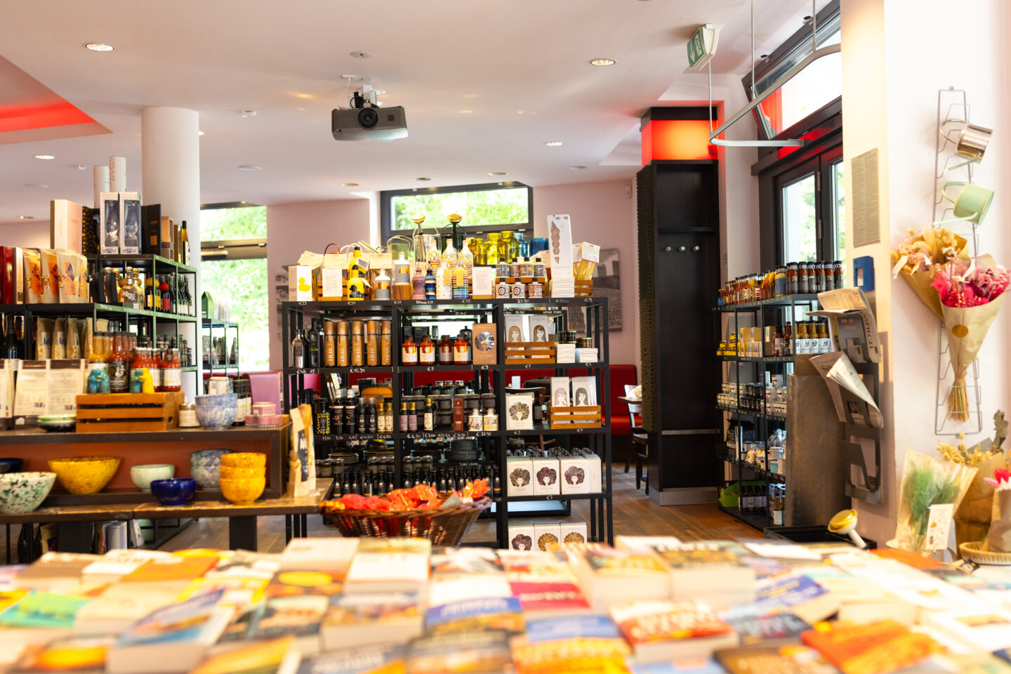
(Picture: Taudtmann Feinkost in Berlin)

Alrie Velleman

1. Product excellence: the cornerstone of a successful fine grocery business

To design your delicatessen in the best possible way, your first focus must be the quality of your products, which is the main reason customers choose this type of shop. The term “delicatessen” immediately implies a carefully crafted selection of top-quality, regionally or locally produced products and exclusive luxury items like caviar and fine champagne. 

Complementing the selection of excellent-quality products, the decoration and layout of the shop must reflect these values and serve this promise. 

Paying careful attention to the finer details will set you apart — from the aesthetic packaging to the clear, elegant labelling which tells a story, including place of production, information on the producers, accompanying advice, recipe ideas, etc.

2. Themed displays: the key to elevate your shopping experience

The shopping experience in a delicatessen must be simple and effective. It is essential to present your products in a way that highlights their characteristics and creates the desire to buy them. 

One tried and tested method is to organise your products by theme. How do you do this? By grouping cheeses, fresh produce, confectionery, etc. together. Delicatessens often have a wine cellar-style area where wines and spirits can be displayed. 

These themed display areas will make it easier to discover your products and give each type of product a strong visual identity.  

You can also take advantage of these themed areas to encourage additional sales: for example, you can offer an “aperitif” area with a mix of crisps, spreads, spirits and cold meats or a “snack” area with a selection of spreads, crackers and fruit juices. 

Finally, nothing quite compares to the feeling evoked by the colourful spectacle of fresh, seasonal fruit and vegetables!

Looking for the next bestsellers in your delicatessen?

Discover our special selection

Discover

3. Interior design: the secret behind a successful fine food store

a. Combine aesthetics with functionality

When designing and fitting out a delicatessen in particular, it’s crucial to acquire furniture suited to the different product types from the start. 

For example, choose open shelving for items you want to show off to their best advantage, but opt for closed shelving when it comes to showcasing more delicate products. Consider investing in bespoke furniture for fruit and vegetable stalls, ideally made of wood and perfectly suited for your commercial premises. 

Our team’s advice: invest in a counter on wheels! It’s versatile and lets you be flexible with your displays throughout the season. You can use it to showcase your bestsellers and special selections. It can even be converted into a tasting area. Last but not least, it’s a practical piece of furniture when busy, allowing you to clear the way quickly!

Remember that every element in your shop exists in correlation with the others and must fit in with your visual identity so that your company’s values and philosophy are instantly recognisable.

b. Create an inviting fresh produce section

If you offer fresh products in your delicatessen, you must implement procedures to guarantee their freshness while making them look as delicious as possible. Your shop aesthetic, along with your personal preferences, will guide the refrigerated display units – whether curved or straight glass, open or closed, etc. Lighting also plays an important role in the presentation of these products. 

(Top tip: When choosing the lights for these displays, remember to use LEDs rather than neon to avoid overheating and reduce power consumption.)

c. Organise taste experiences

A tasting display is a fantastic opportunity to engage your customers and introduce them to new products. So think about creating a warm and friendly space to offer these experiences. Simple but practical ideas include a tasting tray for charcuterie or cheese, small cups for herbal teas, and breadsticks for spreads. Let your imagination run wild!

4. Exterior display: the most effective way to attract passers-by

Fitting out a delicatessen is not just a question of the interior but also the shop’s exterior. That’s why we recommend you take the time to carefully plan your window display and invest in a quality sidewalk display board. This striking duo is sure to turn passers-by into customers!

a. The sidewalk display

The humble chalkboard is the perfect tool for attracting customers to your delicatessen. With funny messages, creative puns, new products or current promotions, you can communicate the latest news and share snippets of your personality with those who don’t know you.

b. The window display

The shop window of a delicatessen plays a central role in your sales strategy. As an important visual focus point, this space must clearly display your company’s values (like organic, regional or local products, vegan, etc.) and encourage passers-by to enter your world of epicurean delights. (It’s also the perfect place to display your bestsellers and new products.)

Here’s how to get the most out of your window display

  • Be intentional with the lighting.
  • Install a focal point to draw attention to a particular item.
  • Follow the pyramid principle when placing your products.

It might go without saying, but always ensure that the decorative elements in your window display match your shop’s overall look and feel. 

Top tip: Regularly change your delicatessen window display, guided by the seasons, sales events or product launches. 

5. Impulse buying: The big power of small details

A positive shopping experience encourages impulse buying, and the first step to achieving this is to perfect the layout of your delicatessen. 

Here are our tried and tested tips for encouraging impulse buying: 

  • Display your promotional products at the entrance to the shop or next to the checkout counter
  • Style your products creatively by placing olive branches around olive oils, flowers or herbs around herbal teas, regional emblems around local specialities, etc.
  • Organise cross-merchandising displays by creating themed selections to encourage complementary sales. 

Delicatessen products are perfect for encouraging impulse buying. Make the most of low-priced sweet items dotted around your checkout counter – think confectionery items, chocolates, cupcakes, etc. Sweet treats, strategically placed, are your ally in increasing sales!

6. The customer journey

The customer journey is the path your customers take through your shop before making a purchase – take the time to plan it carefully. 

Don’t hesitate to test different layouts and, most importantly, take your cue from your customers’ behaviour. Here, old school world best: choose a sample size of customers and record their route. Note which way they started, in front of which display they stopped, tested or touched products, and added products to their baskets. The aim is to find the optimal pattern for your customers and use it to your advantage!

This path should be fluid, subtly guided according to your preferences, with your products placed in exactly the right place (ideally at eye level and hand level) to maximise the chances of a purchase.

In conclusion, establishing a successful delicatessen requires meticulous organisation, creative vision, and a thoughtful approach. Here’s a concise recap of essential considerations:

  1. Prioritise product quality: Make superior product quality the cornerstone of your business strategy.
  2. Themed displays foster cross-purchasing: Engage customers with creatively themed displays that encourage complementary purchases.
  3. Carefully selected furniture reflects your vision: Choose furniture meticulously, aligning it with the envisioned atmosphere of your delicatessen.
  4. Leverage outdoor space strategically: Maximise outdoor areas to enhance your ambience and attract new clientele.
  5. Sweet treats at the checkout are always a good idea: Incorporate tempting sweet treats at the checkout counter for extra sales. 
  6. Optimal layout for an ideal customer journey: Design the layout of your space to facilitate an optimal customer journey, ensuring a seamless and enjoyable experience.

Remember, each delicatessen is inherently unique, and your creativity is your superpower. Experiment, be open to adjustments, and actively seek customer feedback to continually refine your layout and boost sales!

Bonus

As an independent retailer, every day-to-day activity in your business is an opportunity to create content! So don’t hesitate to share your journey on social networks through photos, stories or reels. 

Turn your shop into an unforgettable, must-visit destination! Optimise your point of sale with the advice shared by our retail experts.